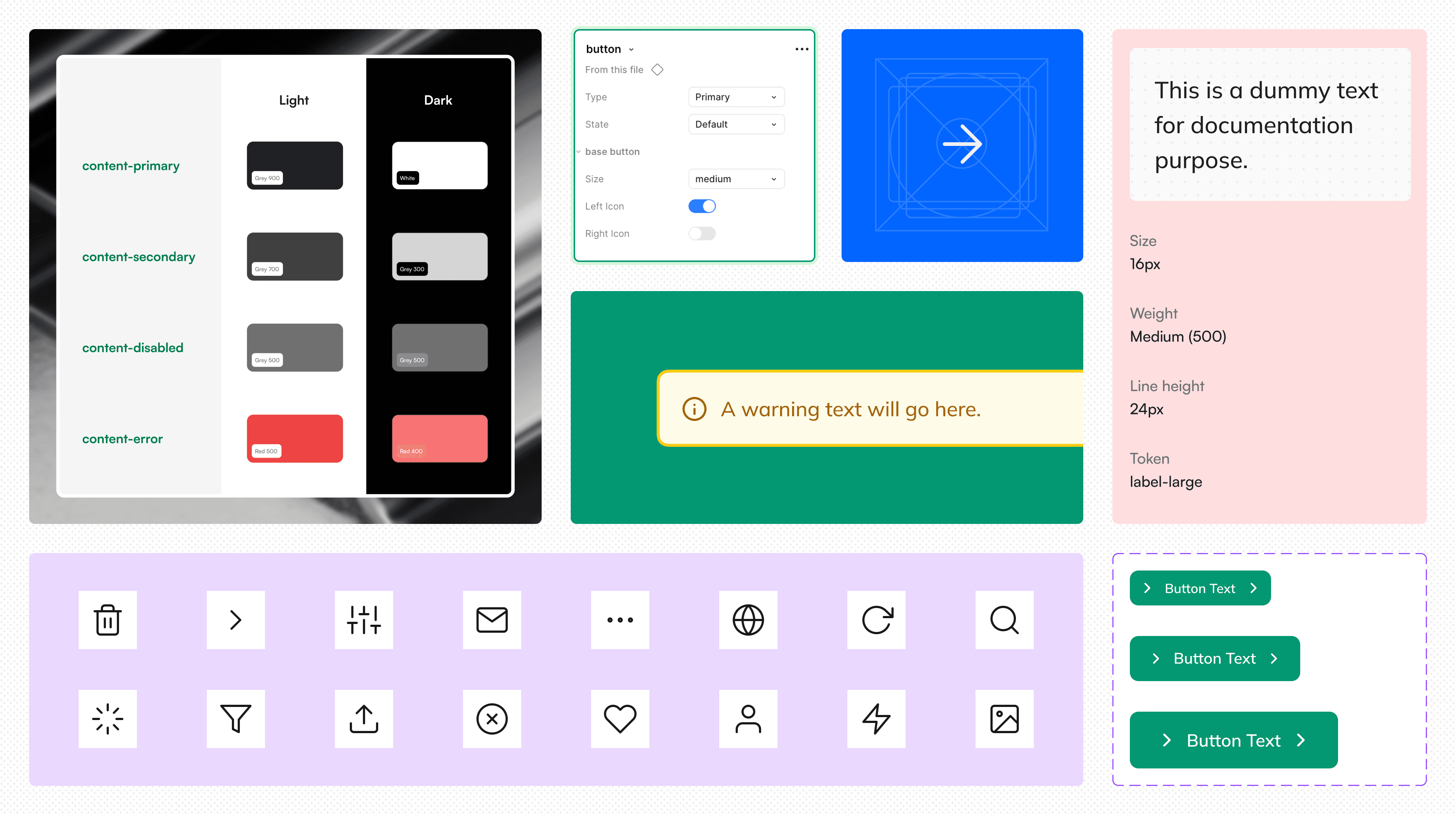
— It began with small signs of friction: inconsistent buttons, missing color, scattered icons, and messy handoffs.
— As the product scaled fast, these inconsistencies slowed us down. We spent more time fixing UI details than solving real user problems.
— It became clear that visual consistency wasn’t just about aesthetics, it directly impacted quality, brand trust, and shipping speed.
I’ve always enjoyed bringing order to chaos, so I proposed a lightweight design system to help our team work faster, stay consistent, and focus on what truly matters. After convincing engineers, PM and fellow designer, I began laying the foundation for a system that could unify our UI decisions, speed up our process, and let us focus more on solving real problems, not design inconsistencies.
Rather than starting with heavy documentation or pixel-perfect tokens, I approached this design system with a builder’s mindset, aiming to solve real problems we were actively facing as a team. I studied the design system of companies I like the most in order to develop a structure for ours.
— Start small, solve real friction – Focus on high-impact components we reused often (like buttons, inputs, forms).
— Build from existing chaos – Audit what’s already been used across the product and refine from there.
— Think systems, not screens – Group components into usable patterns to reduce repeated design decisions.
— Collaborate closely with devs & PMs – Treat the design system as a shared product, not a designer-only space.
Token Library
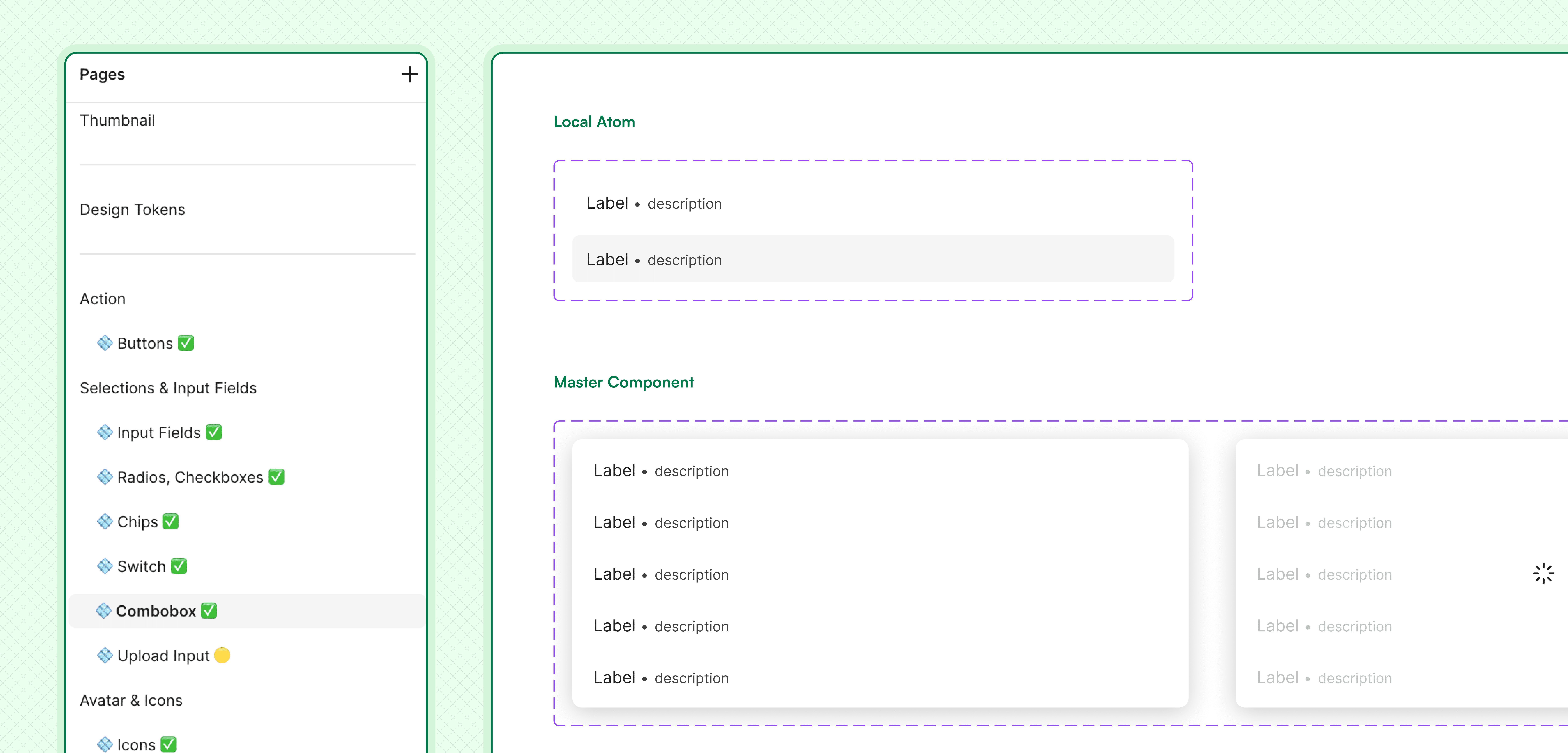
Component Library
Icon Library
Building strong foundations for token library
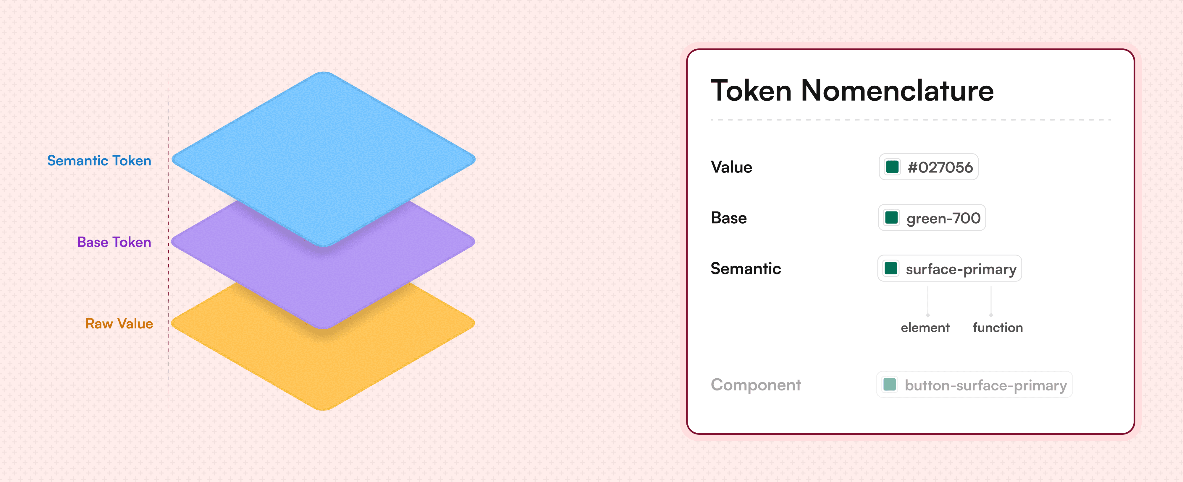
Our token approach had total 3 layers of tokens, We wanted to keep our nomenclature simple, understandable & scalable. I intentionally didn't chose component tokens as it felt unnecessary at that particular stage, similar to design systems like Uber’s BASE for efficiency.
I started by looking into Dev Mode to understand how tokens were implemented, then designed a matching structure in Figma that mirrored those conventions exactly. This made developer communication smooth and error-free.
Every name, hierarchy, and grouping was intentional to ensure parity between design and code. The documentation followed the same principle structured for quick reference rather than overwhelming details.
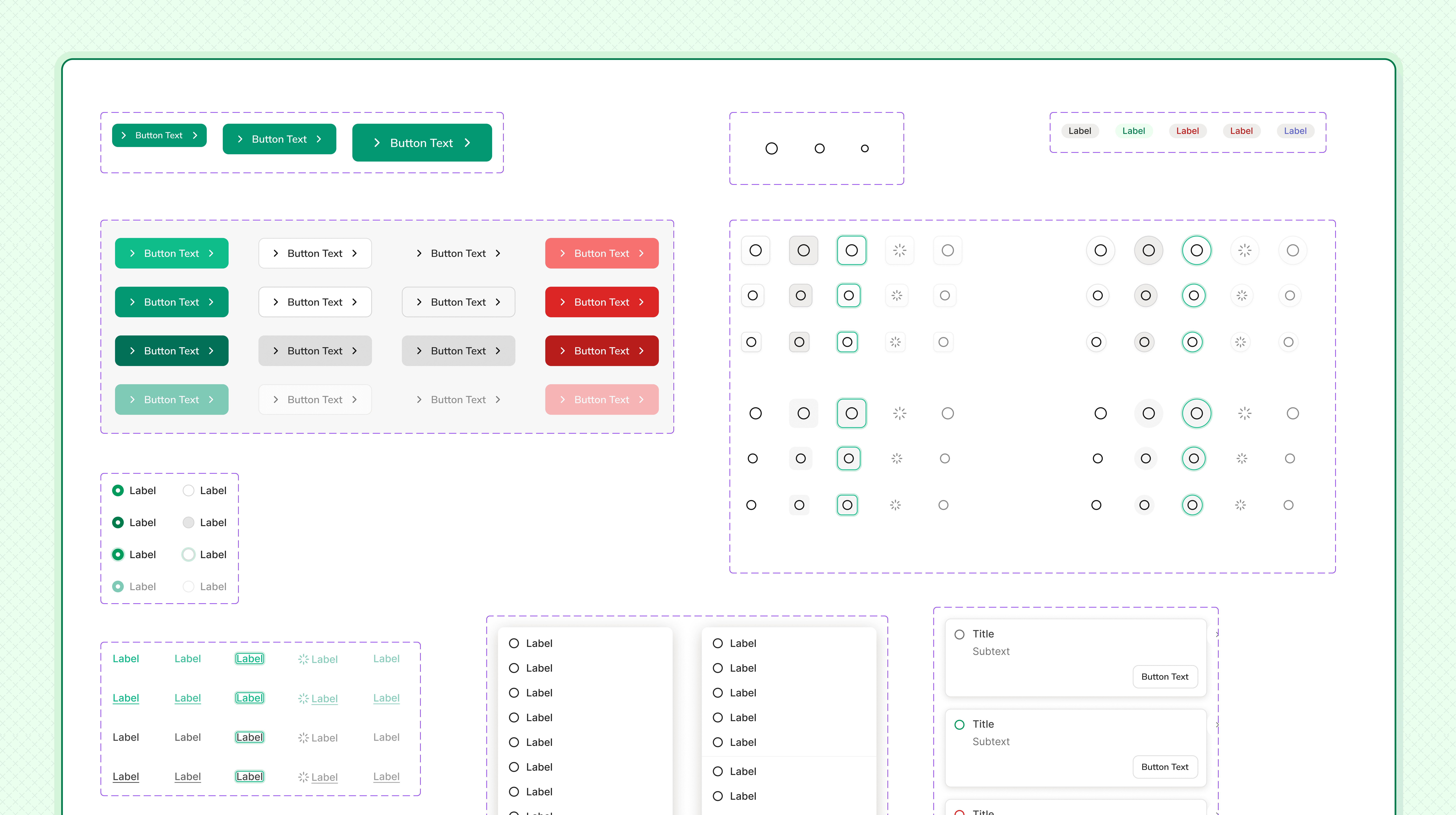
We wanted to build components in a way which were easiest to develop with industry standard quality. I dived deep into component properties during the same which significantly reduced the number of variants, helping us making the library less chaotic.
I worked closely with engineers to ensure pixel-perfect implementation which not only improved consistency but also cut down design debt, accelerated builds, and gave the team confidence to ship faster without second guessing the basics.
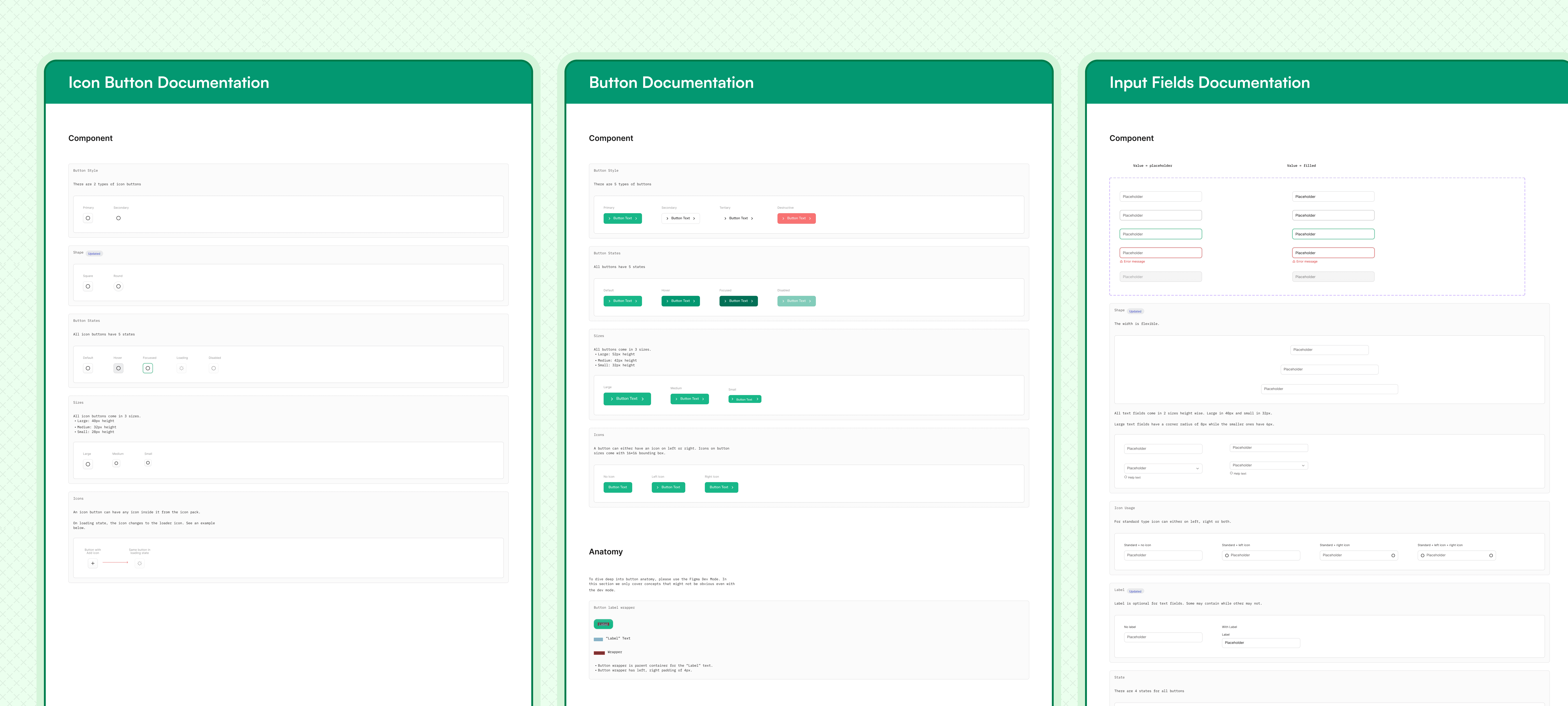
File structure and documentation
I wanted our component system to feel like a well kept workshop, where every tool has its place and is ready to use. So I studied some of the best practices in order to give a seamless structure to our component system.
This included organizing files for scalability and ensuring every component was easy to find, understand, and reuse. Unlike many text heavy design systems, I kept the documentation intentionally clear and concise to make it quick to navigate without losing its depth.
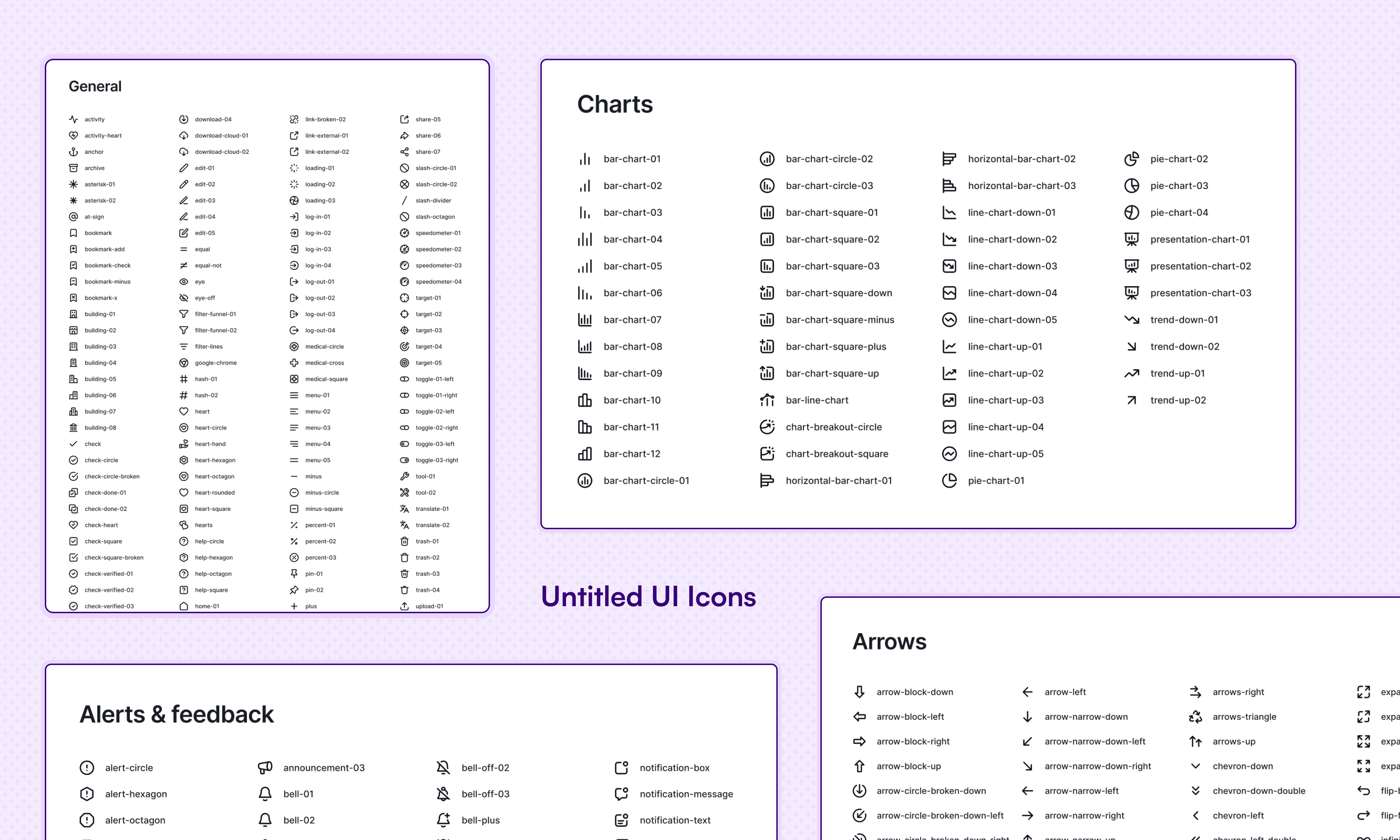
Finding the right icons are harder than finding the right colors and we didn't have bandwidth to work on custom ones. We started with Feather icons then pivoted to Remix icons and finally switched to Untitled UI icons for the range & styles.
One library, endless visual harmony.
I audited icons, categorized different styles, and introduced naming conventions, so that every designer and engineer spoke the same visual language. Over time, it reduced rework, sped up delivery, and quietly became one of the most loved parts of our design system.
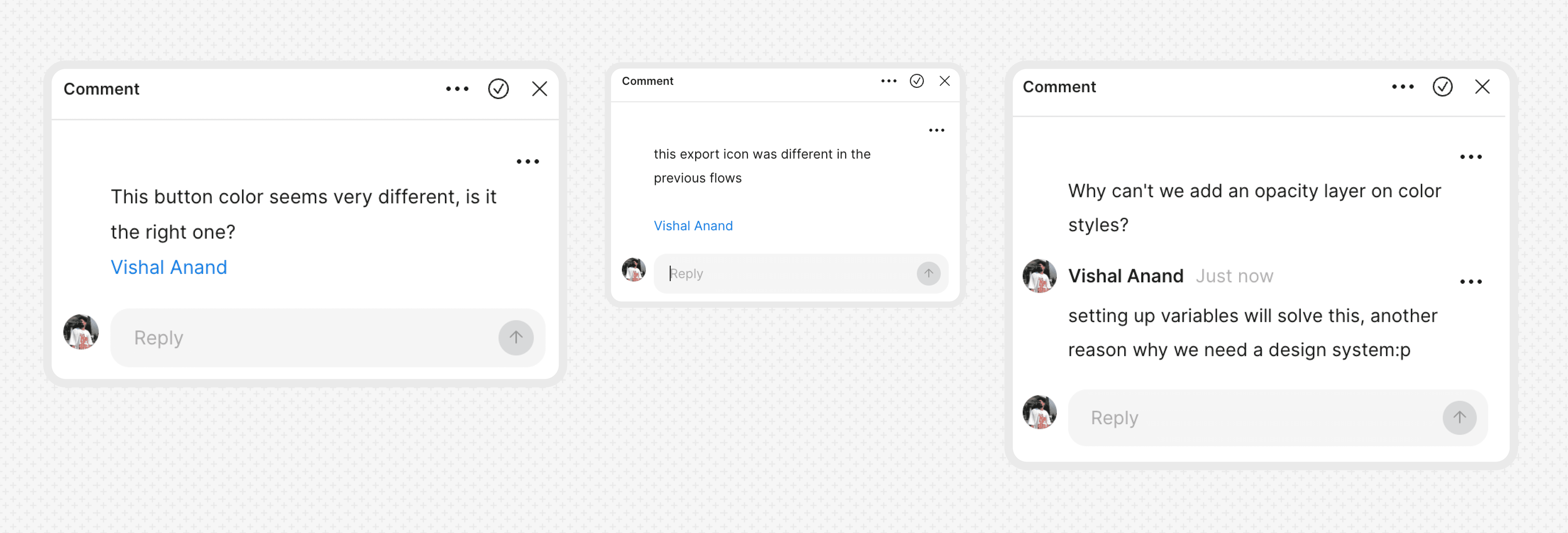
My biggest takeaway was not to hesitate while taking ownership of things throughout this project. Working on a design system end-to-end isn’t just about building, it’s about persistence because metrics are hard to track mid-flight.
As a low-key design system evangelist, I over-communicated with stakeholders, PMs, and engineers, ran Figma demos, and educated the team when needed, ensuring clarity, adoption, and momentum from start to finish. As summarized by an engineer: "it's so insightful to see how tech and design communicate, never thought how close these two are."
Narrative over complexity
Just like stuffing more spices into a dish doesn’t guarantee a better flavor, piling on extra component-variants, tokens, and texts won’t guarantee a better design system. The right constraints helped us craft a system that goes beyond mere consistency, delivering designs with clarity and purpose.
~ Alex Schleifer, Airbnb
~ Nathan Curtis, EightShapes
